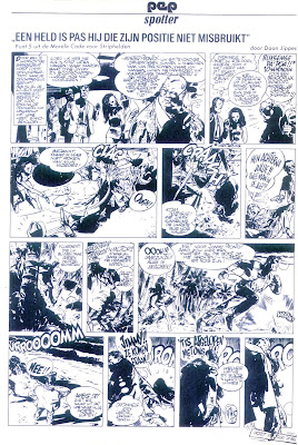
Saturday Leftover Day.
Working on an article for the upcoing 70th birthday of Dutch artist Daan Jippes, I gathered all of the single page Pep Spotter gags he did for Pep weekly in 1970/1973. At that same time he was working on his first (and for a long time only) strip Bernard Voorzichtig and here we see the same shift in style that occurred in the early seventies when he discovered his love for Disney (and especially Floyd Gottfredson and Carl Barks). These mildly satirical gags are in Dutch, so you just have to admire the variety of styles Daan put down even then. I added to that an interview that was done with him at the start of Berbard Voorzichtig, showing a selfportrait and a couple of images of that great first strip.
Saturday, October 03, 2015
Subscribe to:
Post Comments (Atom)


4 comments:
Great showcase for this multi-talented artist. I see influences of Fraqnuin, Uderzo and Morris in some of these samples.
I always admired the lettering in Dutch comics. Strangely they all seem to be done by the same person. I don't know if that was the case, or Dutch artists all ahve the same beautiful calligraphy.
The lettering was done by Richards Studio, who emplayed a lot of different artists. Often, young talent was sent there to earn a few guilders while developing something for Eppo. As similar as they seem, ther often weren't and these days whenever a complete series is reprinted, the publishers have to redo the whole thing to get some sort of uniformity.
That lettering is really great, and though it may look different in some instances, there's an overall similarity, as in the olf American comics. Thta dutch lettering is so great it should be transformed into a font, and so they wouldn't have any trouble reproducing it. It's not as hard as it seems, it's just that book publishers are so lazy these days.
In Argentina when Oesterheld ran his magazines, the lettering was done by a person whose name I can't remember, and then every other letteerer was told to immitate his style. That lettering was converted into a font for a French publisher a while back, but no one else has used it since.
I think it has been turned into a font, which was used for the re-edition of Martin Lodewijk's Agent 327 albums. I'll check.
Post a Comment